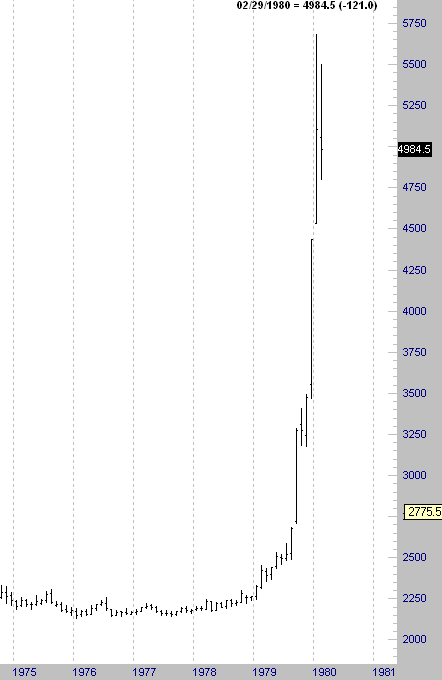
 Anyone out there think these charts look similar? The first chart shows the all time high in Silver made in the early 80's. The second chart shows the most recent price action.
Does anyone think these look in any way similar?
This is the type of thing that is not sustainable. "It's a new bull market in commodities." Perhaps, or is it simply another speculative blow off top? I trade shorter term than this type of analysis requires. However, I do not consider this to be a high probabilty continuation setup the way it looks presently.
No comments:
Post a Comment