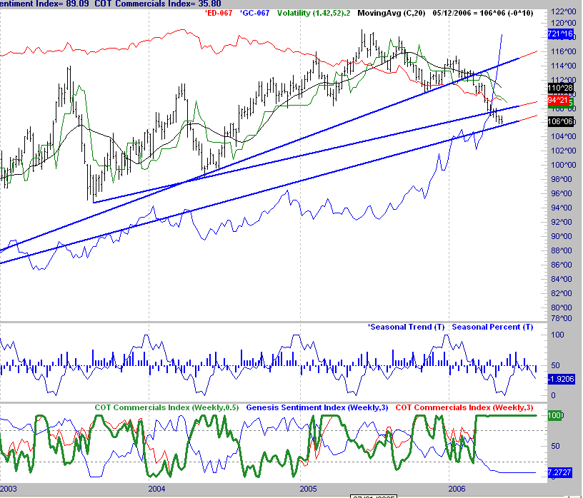
 Today, I am posting the weekly chart of the 30 Yr. Bond Futures. What I have drawn in is all of the possible trend lines that could be drawn upward from the low of 2000. As you can see we are on the verge of breaking the flattest uptrend line on the chart. I am not a big trend line fan, except for just basic uses of them.
What does this mean? It means that the long term uptrend in bonds (downtrend in rates) is on the verge of breaking. However, there are many who feel the fed is close to being done on their tightening program. Notice also that I have displayed the rise in Gold overlayed in blue.
This clearly shows the inverse relationship that exists between these two markets. Also, notice at the bottom, that the commercials have gotten long this market as evidenced by the Green line on the bottom graph, and we are close to the seasonal low (the graph above). All of this tells us the following. We are at an inflection point potentially in this market. Commercials are often early, but when we combine that with the seasonal effect, and a long term trend line, we do have a possible low being set up for longer-term players. If the trend in Gold were down, which would be supportive of bonds, I would be leaning toward the long side big picture here.
I will continue to watch this to see if the Gold fundamental changes, supporting these other things.
Today, I have sell signals in my short term bond trades, which will be followed, but we do have to be on the lookout for a possible low here. If we were to break through these levels sharply, then the setup for a possible low would be negated.
9 comments:
Yes superfly you are correct. One thing to keep in mind with my approach to things is as follows. I am a trader more than an analyst. I trade to make money, not to be right or wrong. This is a key distinguishing point.
What I am exposing here in this blog are some of the basic overviews of things the way I see them. I actually trade very mechanically. As a result, I am short the bonds today based on a bar pattern in one of my systems. It is a trade from the daily trading service on my web site.
I posted that big picture chart to illustrate that we are at a very important inflection point. If we break down from here, prices could go a whole lot lower.
One of the key fundamentals effecting bonds is gold, as can be clearly seen, there is a huge uptrend there. I would not expect to see a major low in bonds, until we see some type of selloff in gold.
Just one other point. It is my belief that unwinding of the carry trade and hedge funds are both liguidating long positions. However, as a trader I do not care about that. I focus on my trading systems, but they need to tie in with fundamentals like intermarket relationships.
All we really need to know is what is happening as a result of it. The commercials hopping on the long side tells us that some very big players are betting on a rally, and that needs to be watched. They often can be early, which they already have been on this one.
Can you explain why the commercials are betting on a bond rally? If China and Japan keep selling their bonds, prices will fall and yields rise. When you say rally, do you mean falling prices or rising yields? What makes a rally in the market?
poway
Superfly has a pretty solid explanation he provided. As to the question of why the commercials have shifted to the long side in bonds, I do not know that. I just monitor what they are doing as a lead to what is going to happen next.
The whole point of bringing them up in the first place was just to point out that there is a fairly simple way to watch what the insiders are doing.
The last 2 days in the stock market show the power of being aware of what they are doing. It is why I posted that chart on Wednesday. There was also a bearish bar pattern on the chart that day that set up a good short term short sale for me that obviously worked out very well.
Can you get your hands on a graph showing the spread for the 30 year treasury Bond contrasted with the DD Junk bonds? I get the feeling that the spread between the two has gotten very small.
Jim
Any idea what the symbol for that would be? In the meantime, I will check and see if it is in my data base.
Chris What I am looking for is a chart that would contrast the interest rate of the 30 year bond (TYX) with the Junk bond rate over say the last 20 years.
Greenspan alluded to the narrowing of the spread, by saying that the perceived risk between the two was not appreciated by the markets--my words, not his. The use of hedge funds options has taken the risk out of the market.
Any ideas on what to google? I've got the some data points, just nothing that realy visual.
Jim
Sorry, I looked for it and found nothing in my data base for it. Look for Ed Yardeni on the web. He seems to have alot of unique things with yields.
superfly
I will post a chart that shows the trade I made. I am already out, it was a short term trade. I do believe based on my research, this drop could be substantial.
To address you question about the bar pattern. I have been a trader for 20 years, and have a collection of bar patterns incorporated into trading systems.
It was one of those patterns that generated it. If you go to my website under trading approach it will give a general overview of how I go about finding these things.
www.iamafuturestrader.com
Post a Comment